
Preview
SharePoint Copilot Apps are in public preview as I write this. The APIs, schemas, and tooling can still change, so treat this as a guide to the model rather than a production blueprint.
What a SharePoint Copilot App actually is
First, the vocabulary, because Microsoft’s naming is precise and worth getting right.
A SharePoint Copilot App extends Microsoft 365 Copilot with custom, interactive UI that you build using the SharePoint Framework (SPFx) tools you already know: heft, TypeScript, SCSS, and the @microsoft/sp-* libraries. The app packages two things together:
- One or more Copilot components, the client-side UI components that render inside a Copilot conversation.
- A declarative agent that makes those components discoverable and callable from the conversation.
The comparison that made it click for me is with the SPFx building blocks I have used for years:
| Extends | Base class | Renders in | |
|---|---|---|---|
| Web part | SharePoint | BaseClientSideWebPart |
A SharePoint page |
| Copilot component | Microsoft 365 Copilot | BaseCopilotComponent |
The Copilot canvas |
So when someone gives kudos in Copilot, they are not chatting with a bot that happens to know about kudos. They are running a real component, hosted in your own tenant, that reads and writes real data.
The three moving parts
Before we trace the message, meet the cast. A Copilot App has three pieces that pass work between them:
- The declarative agent owns the conversation. It carries the instructions that tell Copilot what the agent is for and when to reach for its tools.
- The tool contract is the promise the agent makes to the model: here is a tool, here is what it does, here are the arguments it takes. It lives across
ai-plugin.json, the component manifest, and a Zod schema. - The Copilot component is the code that runs. It takes the arguments Copilot filled in, fetches data, and renders the UI.
Here is the whole journey on one page. Keep it in the corner of your eye as we go.
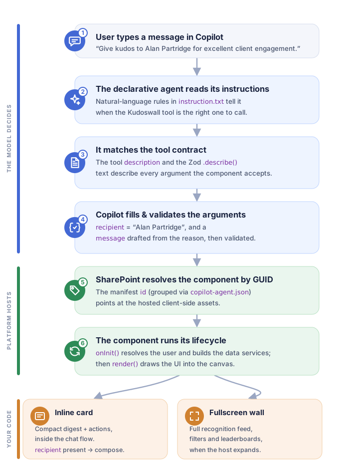
From a sentence to a rendered card. The model decides which tool to call and fills its arguments, the platform hosts the component, and your code renders the result.
Behind the scenes: how the message becomes a card
This is the part most walkthroughs skip, so it is worth slowing down.
The agent reads its instructions
When the user picks the Kudos & Recognition Wall agent and types their sentence, Copilot does not see code. It sees the agent’s instructions, a short piece of plain English that frames everything. The sample’s instruction.txt, trimmed to the key rule, reads:
When someone asks to give, send or record kudos, or names a colleague they want |
Notice the two jobs it does. It tells the model when to call the tool, and how to map the sentence onto arguments (name to recipient, reason to message). It even asks the model to stay quiet in text, because the card will speak for itself. Good instructions are the difference between an agent that reliably does the right thing and one that guesses.
It matches the tool contract
The instructions say to call the Kudoswall tool. But what is that tool? The model reads its contract, which two files describe. First, ai-plugin.json gives a plain summary of the action:
{ |
Then the component manifest declares the tool itself and points at the schema that defines its arguments:
"tools": [ |
That description is not documentation for people. It is a piece of prompt the model reads to decide whether the tool fits and how to fill it. Write it as if you are briefing the model, because you are.
It fills and checks the arguments
Now the model turns Give kudos to Alan Partridge for being excellent with client engagement into structured arguments. It knows their shape from the properties schema, which the sample defines with Zod:
const propertiesSchema = z.object({ |
Two small things are doing a lot of work here.
The .describe() text on each field is exported into the JSON Schema and handed to the model. It is how Copilot knows recipient is a name (Alan Partridge) and message is the recognition text it should write from the reason you gave. Vague descriptions give vague extraction; specific ones give precise extraction.
The zodToJsonSchema(...) default export means the same schema that types your TypeScript also becomes the contract the host uses to validate the arguments before your component ever runs. One definition, two jobs.
So Copilot fills in recipient = "Alan Partridge" and drafts a message from your reason, then checks both against the schema before making the call. That draft is a starting point, not the final word: it lands in the card for you to read, edit, and approve before anything is saved.
SharePoint finds the component by its GUID
This next part surprised me. Nothing in the agent files imports the component. The wiring is all metadata. The manifest carries a stable id (a GUID) and declares its type:
{ |
At build time a config/copilot-agent.json file groups the agent with the component GUIDs it should host, and the toolchain merges the two sides into the package. Because the link is a GUID and not a code reference, the same agent can be assembled with different components, and the whole app moves between tenants by deploying the .sppkg. When Copilot decides to call the tool, the platform looks the component up by that GUID and loads its assets, which are hosted in your own tenant.
The component runs its lifecycle
Only now does your code run. A Copilot component extends BaseCopilotComponent and follows a small, predictable lifecycle. Here is the sample’s component, lightly condensed:
export default class KudoswallCopilotComponent |
Read onInit from the top and the design choices explain themselves.
this.properties.recipient is the argument Copilot filled in back at the previous step. The component reads it straight off this.properties, with no plumbing.
KUDOS_SITE_URL is there because a Copilot component has no page context the way a web part does. There is no current site, so the data service has to be told which site to talk to.
Graph is brokered, with a fallback. SSO is handled for you, and if Graph is not available (as in the workbench) the services quietly switch to mock data so nothing hard fails.
resolvePerson turns the string “Alan Partridge” into a real directory person, so the compose card opens with the right colleague selected.
Then render() mounts the React tree, and the message finally becomes pixels.
How it picks the right view
The component we just met can show four different things, and it decides between them from only two inputs. That is what lets one component feel like several tailored experiences.
The two inputs are the display mode (inline or fullscreen), which the host owns and delivers on this.hostContext.displayMode, and whether recipient was supplied. The sample reads them with two small helpers:
// inline in the conversation, fullscreen when the host expands the canvas. |
Cross the two and you get the full behaviour:
| Display mode | recipient present? |
What the user sees |
|---|---|---|
inline |
Yes | Compose card, pre-filled to thank that colleague |
inline |
No | Launcher digest, recent kudos plus a Give kudos action |
fullscreen |
Either | Full recognition wall, feed, filters, and leaderboards |
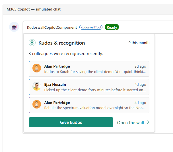
With no colleague named, the same tool opens the launcher instead: a compact digest of recent recognitions, with Give kudos and Open the wall actions.
How the display mode works
Your component reads the current mode on every render and can request a switch with requestDisplayModeAsync('fullscreen'), the only mode it may ask for. Collapsing back to inline is the host's job: the user clicks the host's own control and your component simply re-renders. There is no built-in expand button either, so you render your own and wire it to that call, which is what onRequestFullscreen does above.
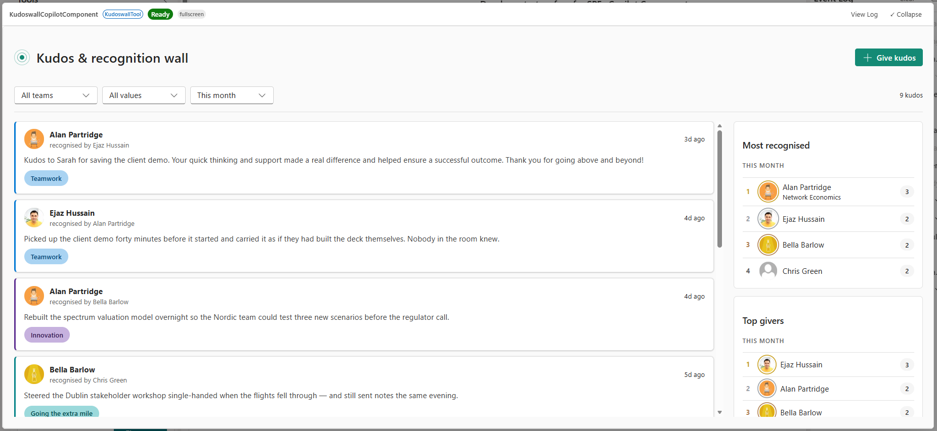
Ask to see the wall and the host expands the canvas: the same component, now rendering the full feed with team and value filters plus the leaderboards.
Getting started, without provisioning anything
The part I like most about these apps is that you can run the whole thing against mock data before touching SharePoint. The Kudos sample ships a mock backend for exactly that.
1. Clone and run. From the sample folder:
npm install |
Copilot components cannot run in the classic local workbench, so npm run start serves your component to the Copilot Workbench instead. It lives at the /_layouts/15/copilotworkbench.aspx path of any site in your tenant, for example:
https://yourtenant.sharepoint.com/_layouts/15/copilotworkbench.aspx |
Load it, accept the debug manifest when asked, activate the component, and fire a turn to see it render with the properties you pass. It is a quick loop of rebuild, refresh, iterate, against a real Copilot surface. Under the bonnet this is the SPFx heft toolchain, so you can also run heft start --nobrowser directly.
2. Force the mock, or go live. The sample uses mock data automatically when there is no provisioned list, or whenever you add ?kudosMock=1 to the workbench URL, which is handy for demos. To run against real data you provision two SharePoint lists (a Departments vocabulary and a Kudos list) and point the component at the site with KUDOS_SITE_URL. The README has the exact provisioning scripts.
3. Package and deploy. When the workbench looks right, build the package:
npm run build |
Upload the .sppkg to your app catalog, enable it, and choose Add to Teams. That one action deploys the declarative agent to your tenant’s agent catalog; there is no separate publishing step in Copilot. Grant the optional User.ReadBasic.All Graph permission and the recipient picker searches your real directory and reads each colleague’s department. Without it, the component falls back to its mock roster.
Watch the agent version
Every time you change the agent side (its instructions, conversation starters, or actions), bump the declarative agent version. If you leave it the same, Copilot may keep serving the previously synced definition even after you redeploy.
What I took away
A few things stuck with me while building this. The tool description and the Zod .describe() text are not comments; they are the words the model actually reads, so they deserve the same care as any prompt. The same component becomes a compose card, a launcher, or a full wall depending on its arguments and the display mode, which means you ship one component and serve many scenarios. And the link between agent and component is a GUID rather than a code reference, which is what lets the app move cleanly between tenants as a single package.
The bigger shift is this. Copilot stops being a place that only returns text about your systems and becomes a place that renders live interactions with them. A sentence goes in, a working card comes out, and everything in between is code you own.
Source code
Source code
The complete Kudos & Recognition Wall sample is on GitHub, ready to clone and run against mock data.
References
- Microsoft Learn, Overview of SharePoint Copilot Apps (preview), https://learn.microsoft.com/en-us/sharepoint/dev/spfx/copilot/overview-copilot-apps
- Microsoft Learn, Display modes in SharePoint Copilot components, https://learn.microsoft.com/en-us/sharepoint/dev/spfx/copilot/displaymode
- Microsoft Learn, Build your first SharePoint Copilot App, https://learn.microsoft.com/en-us/sharepoint/dev/spfx/copilot/get-started/build-your-first-copilot-app
- Microsoft 365 Copilot extensibility documentation, https://learn.microsoft.com/microsoft-365-copilot/extensibility/
- Zod, TypeScript-first schema validation, https://zod.dev